Android vs iphone market share us and its impact on mobile seo strategy
Android vs iphone market share us and its impact on mobile seo strategy
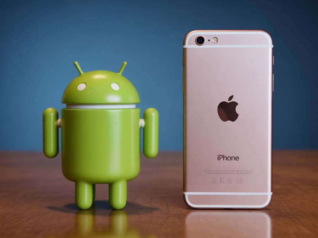
Understanding the Android vs iPhone Market Share in the US
As of 2024, the mobile landscape in the United States remains a tale of two giants: Android and iOS. While both play dominant roles globally, their market shares differ significantly by region — and in the US, this has measurable consequences for SEO strategy.
Let’s go straight to the numbers. According to StatCounter, iOS holds approximately 57% of the US mobile OS market, while Android hovers around 42%. That’s a significant tilt in favor of Apple compared to global figures, where Android dominates with over 70%.
If you’re crafting a mobile SEO strategy for the American market and not factoring in these dynamics, you’re shooting in the dark. Let’s unpack what it means for your organic visibility, UX optimization, and ultimately your conversion funnels.
Platform Usage Impacts Search Behavior
Different platforms foster different user behaviors. iPhone users, for instance, are more likely to use Safari as their default browser, while Android users primarily default to Chrome. Why does this matter for SEO?
Because browser choice impacts:
- Caching and rendering: Safari and Chrome don’t interpret JavaScript heavy pages the same way.
- Search engine preference: While both platforms use Google as the default search engine, the subtle integrations with Siri and Spotlight mean iOS users often reach content indirectly. Think featured snippets and knowledge panels.
- User experience expectation: iOS users tend to expect cleaner, faster mobile sites with a more « app-like » feel.
If your mobile SEO plan isn’t tailored to the platform’s typical behavior patterns, there’s a good chance you’re leaving traffic and conversions on the table.
Site Performance: iOS Users Are Less Forgiving
Let’s talk bounce rates. Data shows that iPhone users typically have lower tolerance for slow-loading sites. They’re often in higher income brackets, expect premium digital experiences, and tend to abandon ship after just a couple of seconds of load time lag.
If you’re targeting predominantly iOS users (think fashion retailers, SaaS, or fintech), then your Core Web Vitals — especially LCP and FID — need to be on point. That may translate into:
- Using fewer heavy third-party scripts
- Optimizing your critical rendering path
- Efficient lazy-loading of below-the-fold assets
Pro tip: Always test your site performance on both an iPhone and a mid-tier Android device. A site that feels “fast enough” on a Galaxy A7 can feel sluggish on an iPhone 13 if your JS is bloated.
Voice Search Optimization: A Platform-Driven Approach
Consider this: Siri and Google Assistant don’t behave the same way. They fetch answers differently, source snippets from different places, and even frame results in different tone and vocabulary. So if voice search matters to your strategy — and it should, especially for local SEO — then Android vs iOS usage is critical intel.
For iOS-heavy segments, prioritize:
- Becoming the featured snippet for question-based queries
- Structured data with FAQ markup to feed Siri’s natural language processor
- Mobile readability — Siri reads out loud; long-winded answers get cut off or skipped
For Android-first audiences:
- Optimizing for Google Assistant’s direct answer structure
- Leaning into “near me” searches for Physical Business SEO
- Using schema markup to define locations, business hours, and services
UX Variations: One Size Doesn’t Fit All
Your design choices matter more than ever. UI components like pop-ups, floating CTAs, and cookie banners may behave smoothly on an iPhone but collapse awkwardly on Android browsers — or vice versa.
Here are a few tactical things to test across devices before calling your design « responsive »:
- Touch-target sizes — Android users deal with a wider range of screen resolutions and pixel densities
- System font rendering — iOS typically renders fonts like Helvetica or San Francisco more crisply than Android on mobile
- Fixed positioning — what stays fixed on an iPhone 14 might scroll away unexpectedly on a Pixel 6
SEO isn’t just meta tags and backlinks — it’s also how usable your pages are, device by device.
Conversion Rates: iPhone Users Often Spend More
Let’s say you’re optimizing an e-commerce funnel. You’ve done all the technical SEO heavy lifting. Great. But if your conversion rate on iOS is sluggish compared to Android or vice versa, it’s a strong hint that the UX or CTAs are misaligned with user platform expectations. And guess what?
A report by RJMetrics found that iPhone users tend to spend 1.6x more per transaction than Android users on average. That totally recalibrates how you might allocate A/B testing budgets or CRO efforts. If your traffic sources lean 60% iOS, your mobile-first design decisions should too.
App Indexing and Interstitials: A Slippery Slope
If you’re running a mobile-first experience through a hybrid app/web strategy, iOS vs Android matters even more. Apple is notoriously strict on interstitial use. Remember Google’s penalty for intrusive interstitials? It hits harder when iOS is your dominant traffic generator. Reason: Apple users are more likely to hit Safari, which doesn’t ignore overlays the way some Android browsers do.
For sites with native apps, deep linking behavior also varies. Android supports Firebase App Indexing out-of-the-box. iOS? You’ll need Universal Links configured… correctly. Mess it up, and you’ll burn bounce-prone sessions that you could’ve retained.
My advice? Segment your GA4/Hotjar data by OS and assess drop-offs related to app prompts or deep linking patterns.
Keyword Research: Segment by OS Early
This might surprise you: platform preference influences query types and intent structures.
Example: An iPhone user searching for “financial apps” may expect a more polished UX and subscriptions, while an Android user might be comparing free versions or looking for APKs. Your SERP position is tied not only to relevance, but to the perceived fit for the user’s ecosystem.
My tip? Use GA4 to assess device OS per landing page, and compare those against Google Search Console query reports. You might discover that “iOS productivity apps” performs 3x better than the broader “best productivity apps” for your content — and the inverse holds for Android.
Also valuable: Examine user session depth and time-on-page by device OS. You’ll often find that one platform prefers shorter, more transactional content, while the other lingers on comparison-based articles.
When to Prioritize iOS, When to Double Down on Android
Let’s wrap with a reality check. You don’t always need to optimize equally for both ecosystems. It really depends on your target demo:
- iOS-dominant brands: Think luxury, fashion, media, finance. Invest in mobile polish, voice optimization, and Safari-friendly design systems.
- Android-heavy segments: Think education, budget e-commerce, utilities. Focus on crawlability, lightweight assets, and Firebase integrations.
Use your existing data — not assumptions — to decide which platform deserves deeper SEO resources. Run device OS reports in Looker Studio. Layer that with UX heatmaps. Don’t just build for mobile. Build for the right mobile.
Your SEO results will thank you — regardless of whether they come from a $1,000 iPhone or a $200 Android handset.